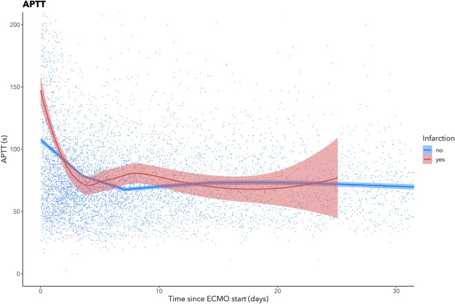
Figure 4.
Scatterplot of activated partial thromboplastin time (APTT) depicted longitudinally and subdivided according to brain infarction status. Samples were collected during the first month of treatment or until BI detection. The red line represents patients that suffered brain infarction on ECMO, the blue line represents patients with no signs of infarction. The line indicates a LOWESS curve and the shaded area surrounding it indicates 95% confidence intervals. The graph was created using ggplot 2 (Wickham H. ggplot2: Elegant Graphics for Data Analysis, 2016. NY: Springer-Verlag).

