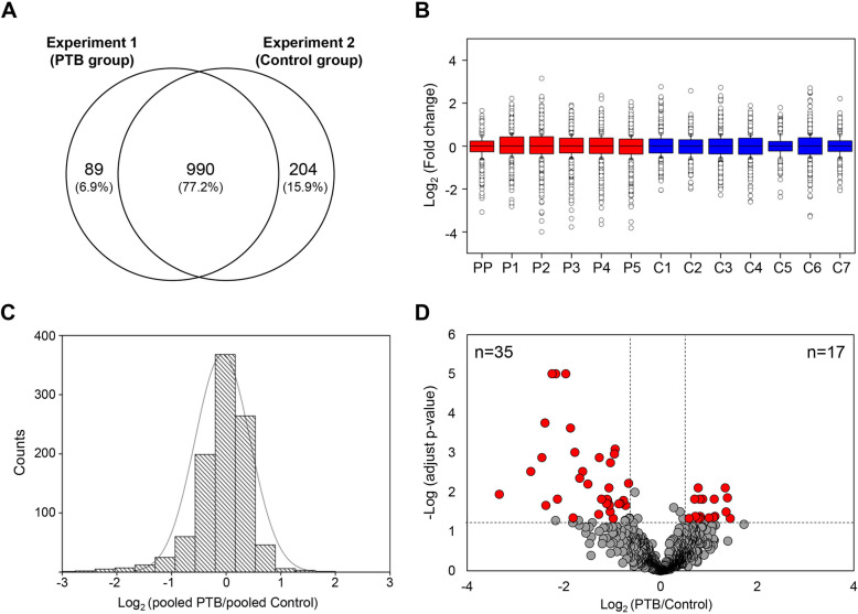
Fig. 3.
Quantitative proteomic comparison of CVF between PTB and control group. a Venn diagram illustrating the overlap of protein quantified in PTB (Experiment 1) and control (Experiment 2) group. b The box plot of normalized log2 iTRAQ ratios for PTB group versus pooled control (115/114, 116/114, 117/114, 118/114, 119/114 and 121/114) and control group versus pooled control (113/121, 114/121, 115/121, 116/121, 117/121, 118/121 and 119/121). A line across the box represents the median and outliers correspond to log2 values greater than 0.58 or less than − 0.58. PP, pooled PTB; P, PTB; C, control c The histogram distribution of normalized log2 iTRAQ ratio between pooled PTB and pooled control d A volcano plot of significantly changed proteins between PTB and control group. A plot is constructed from log2 fold-change (x-axis) and – log Benjamini-Hochberg adjust p-value (y-axis) for iTRAQ data of PTB and control group. The threshold for determining significantly differential expression is indicated by dashed lines (adjust p-value < 0.05, fold-change > 1.5). Dots selected in red indicate significantly up- and down-regulated proteins

