. 2020 Dec 29;9:e62238. doi: 10.7554/eLife.62238

Figure 4. Viral dynamics mimic nuclear dynamics.

Killer phenotype of evolved populations is indicated by color according to the key. Nuclear dynamics (reported previously in Lang et al., 2013) are represented as solid lines. Nuclear mutations that sweep before or during the loss of killing ability are indicated by black lines. All other mutations are indicated by gray lines. Viral mutations are indicated by purple dashed lines and labeled by amino acid change.

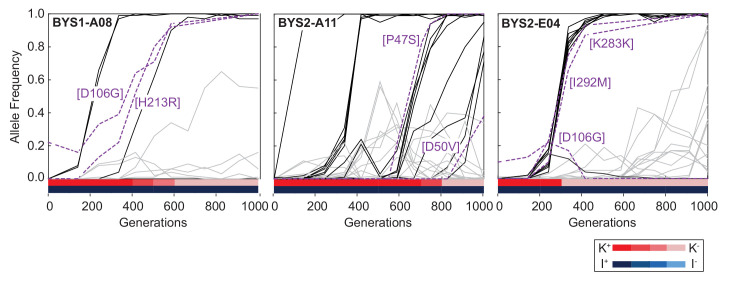
Figure 4.

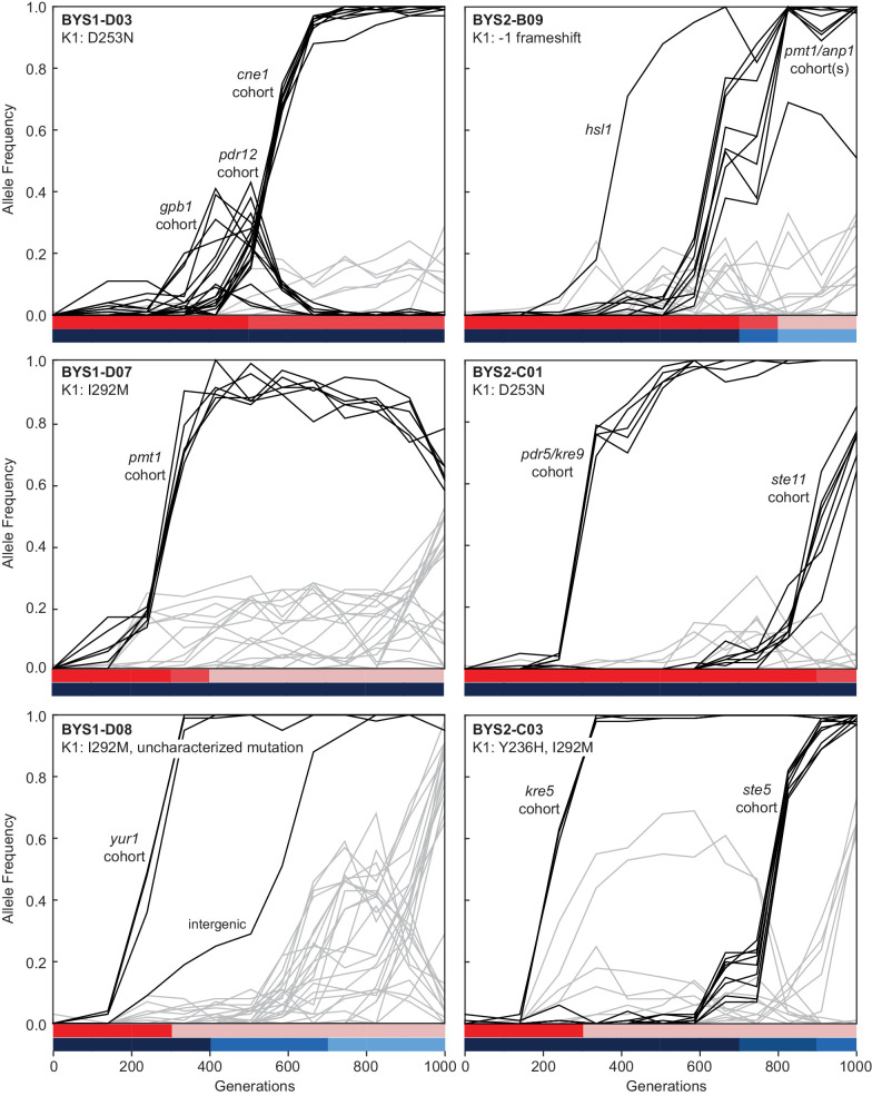
Figure 4—figure supplement 1. Evolutionary dynamics of nuclear genotypes and killer phenotypes over time.

Figure 4—figure supplement 1.

The K1 mutations detected in each population at Generation 1000 are indicated in the top-left of the plot. Trajectories of nuclear mutations were obtained from Lang et al., 2013. Black lines indicate nuclear mutations that swept up to and including the period of killer phenotypic change (all others nuclear mutations are gray). Mutational cohorts are labeled according to their putative driver or putative toxin resistance mutation. Killing ability and immunity are indicated in bar graph (bottom) by shades of red and blue, respectively.