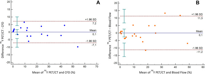
Figure 8.
Bland–Altman plots for the differences in distribution in the 21 liver segments studied. (A) Difference between in vivo (90Y PET/CT) measured activity distribution and in silico (CFD) simulated activity distribution (%). (B) Difference between in vivo (90Y PET/CT) measured activity distribution and prescribed blood flow distribution (%). Solid blue lines indicate the mean of differences, dotted lines indicate upper and lower limits of agreement (LoA) and error bars the 95% confidence interval for both the upper and lower LoA and the mean difference.

