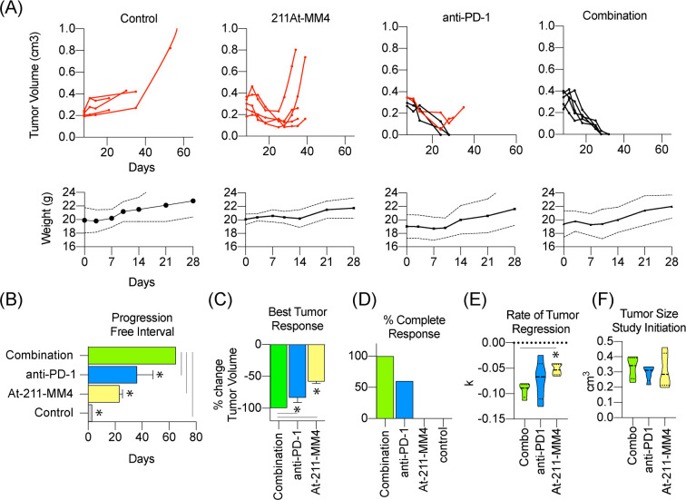
Figure 3.
In vivo efficacy analysis of single-agent or combination therapy using [211At]MM4 and/or anti-PD-1 (n = 5/group). Mouse weights are shown below for each treatment arm (dotted lines represent standard error bands). (A) Individual tumor growth curves for control, single-agent, and combination treated groups. Red lines signify mouse subjects that progressed after best response. (B) Swimmer plot of average progression free interval of each group. (C) Waterfall plot of best tumor response after treatment. (D) Bar graph showing percentage of complete responses for each treatment group. (E,F) Violin plots for (E) tumor growth rate (k) modeled for each treatment group and (F) tumor size at initiation of study.

