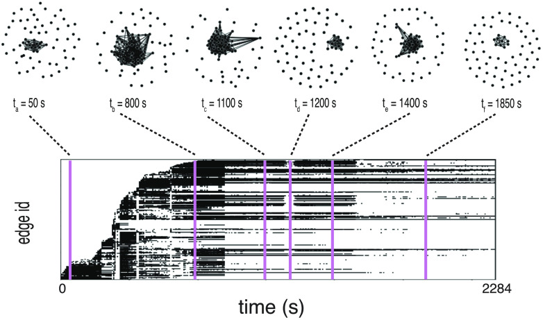
Figure 2. .
Temporal network visualization. Evolution of the information sharing temporal network computed for one of the recordings, represented using the visualization toolbox TACOMA (http://tacoma.benmaier.org/about.html). The six networks on the top plots represent six snapshots of the network’s evolution at the corresponding times: Each black dot represents a neuron whose activity has been recorded at the corresponding time. The bottom panel displays the temporal network’s edge activity plot: Each row of the plot represents the activity of one edge of the network, i.e., a black dot on a row means that the corresponding edge on the vertical axis is active (a nonzero element of the network’s adjacency matrix) at the corresponding time on the horizontal axis. The edges are ordered on the vertical axis by increasing value of their first activation time.

