Fig. 1.
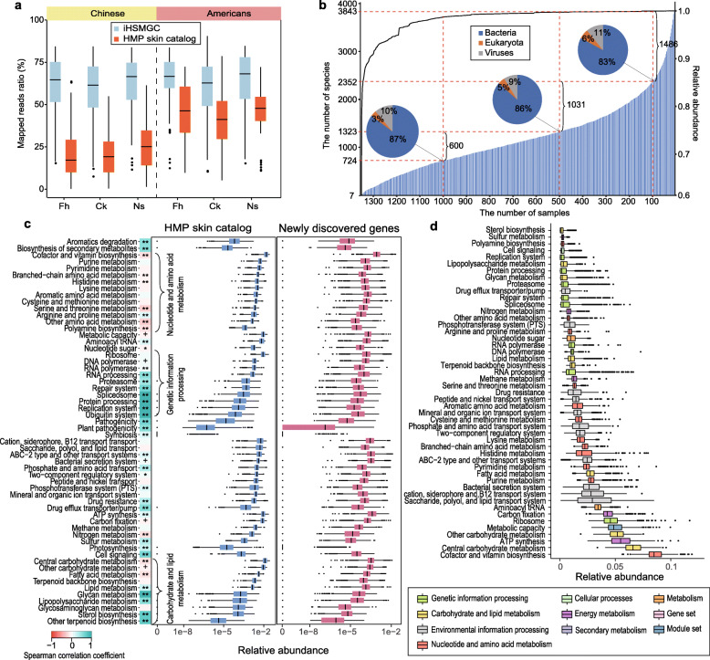
Evaluation of the integrated Human Skin Microbial Gene Catalog (iHSMGC). a Box plots comparing the reads mapping rate between the HMP skin catalog and the iHSMGC with two sets of sequencing data from this study (Chinese) and previous HMP study (Americans). Fh forehead, Ck cheek, and Ns the back of the nose. b The prevalence of certain microbial species in the population. The shadow bar chart (correspond to the left Y-axis) represents the number of microbial species that appeared across a certain number of samples (X-axis); the dashed lines separate the samples at sample size 1, 100, 500, 1000, respectively. The pie charts represent the corresponding proportion of bacteria, fungi, and viruses at the sample size 100, 500, 1000. The linear curve (correspond to the right Y-axis) quantifies the cumulative relative abundance of these species presented across the samples. c Box plot comparing the functional modules from the HMP gene catalog and newly identified genes in the iHSMGC. Box plots quantify the relative abundance of the genes within the corresponding functional module (vertical listed). The heat map next to the list represents the Spearman correlation coefficients between the genes in the HMP catalog and the genes newly identified within a certain functional module in terms of the gene abundance (+ p < 0.05, * p < 0.01, ** p < 0.001). d Box plot representing gene relative abundance from Han Chinese samples involved in a certain functional module. Different colors represent different functional modules in the KEGG KOs (B-level)

