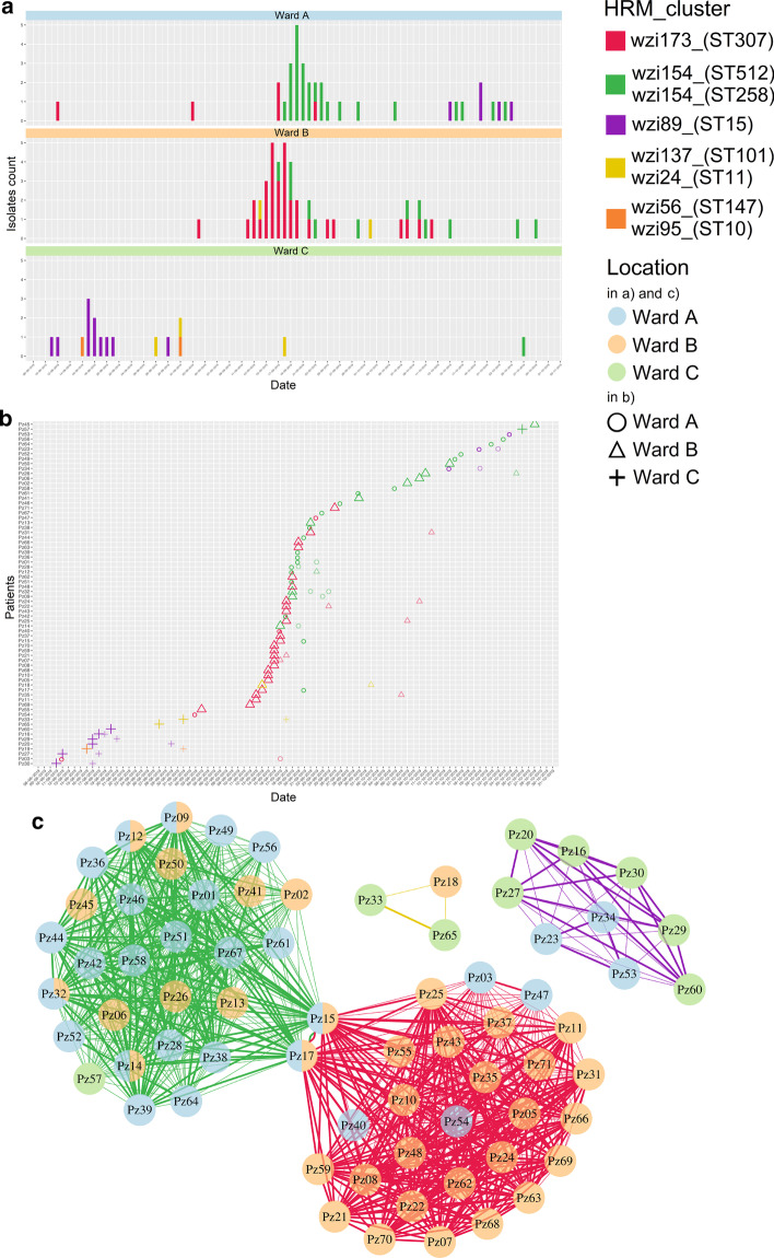
Fig. 1.
MeltingPlot Output, example of an epidemiological investigation. Here we report the three most significant MeltingPlot output plots obtained on the simulated dataset. The plots were selected to show the power of the HRM-based epidemiological investigation performed by the tool. Higher resolution images are available in the Additional file 1. a Prevalence analysis: the plot shows the number of isolates collected from each hospital ward over time. Each HRM cluster is represented with a different color. This analysis allows the detection of the pathogen clones emergence in the hospital setting. b Patients’ timeline: each row refers to a patient and the symbols represent isolates. The shape of the symbols report the location where the isolates were collected while the colors indicate the HRM cluster. c Patient-to-patient graph: each vertex represents a patient and two vertices are connected if isolates belonging to the same HRM cluster were collected from both patients. Vertices are reported as pie charts and colors show the locations (wards) where the isolates of the patients were collected. The edges of the graph are thicker if the isolates from the same HRM cluster were collected within seven days (this threshold can be defined by the user) from the same location. This plot can help to identify the transmission routes of the pathogen in the hospital setting

