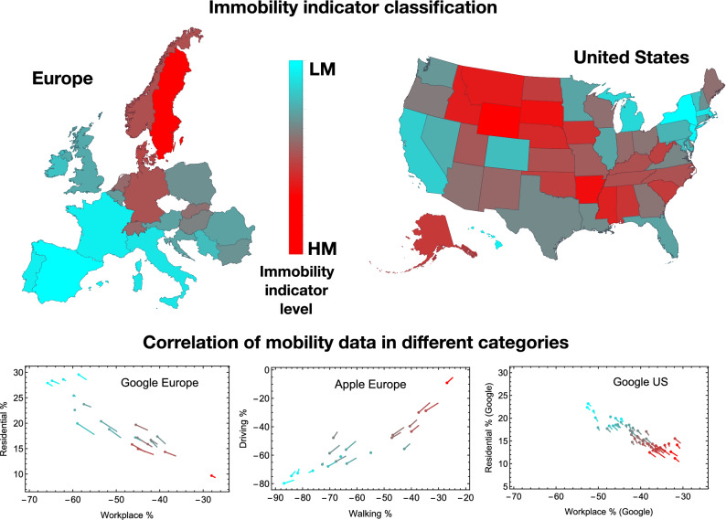
Figure 1.
The COVID-19 Mobility Map for Europe and the US. The two maps represent respectively the European and US states with different shades of mobility from the highest (HM) in bright red to the lowest (LM) in cyan. At the bottom of the figure there are three tadpole-like plots showing correlations between the four mobility reduction categories: Residential and Workplace from Google, Driving and Walking from Apple. The head of the tadpoles correspond to the average over 6 weeks after social distancing begins, while the tail indicates a 8 week average. The colour code in the three plots reflects the maps one. The maps are drawn with Wolfram Mathematica.

