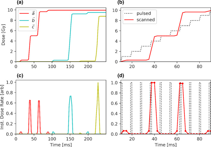
Fig. 2.

The panels in the left column show cumulative dose (a) and instantaneous dose rate (c) plotted for the three color‐coded points of interest identified in Fig. 1. The panels on the right column show an example electron bbFLASH (black dotted curve) and PBS (solid red line) delivery. Panels b and d display the cumulative dose and the instantaneous dose rate, respectively, for the red point in Fig. 1 as a function of time. [Color figure can be viewed at wileyonlinelibrary.com]
