Fig. 3.
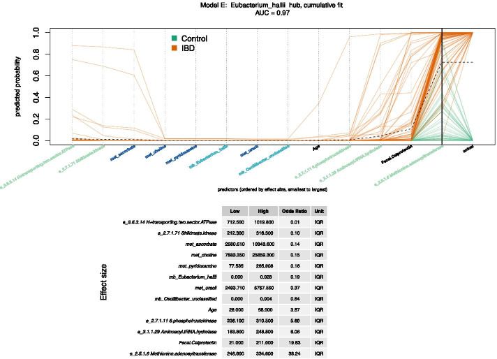
Cumulative fit for Model E. This model was created from the E. hallii hub. It has the best AUC (0.97) of the top 3 models and the most predictors (13). The cumulative fit graph displays predicted probability by accumulating the contribution of one predictor at a time. A dotted black “trend line” connects the mean cumulative value at each predictor. Omic predictors are prefaced by e, met, or mb, representing enzyme, metabolite, or microbe respectively. Each orange path represents one study participant with IBD, while each green path represents one control participant. The intersection of the paths and the bold black vertical line represents predicted probability for each person, while the final points of the paths indicate the actual class. The predictors are ordered by IQR effect size, low to high. The intercept is not shown. Effect sizes for each predictor are expressed as the odds ratio for IBD for interquartile range (IQR). The IQR effect size is the change in response associated with a change in a predictor from the first quartile (Q1, 25th percentile) to the third quartile (Q3, 75th percentile), which includes 50% of the data values

