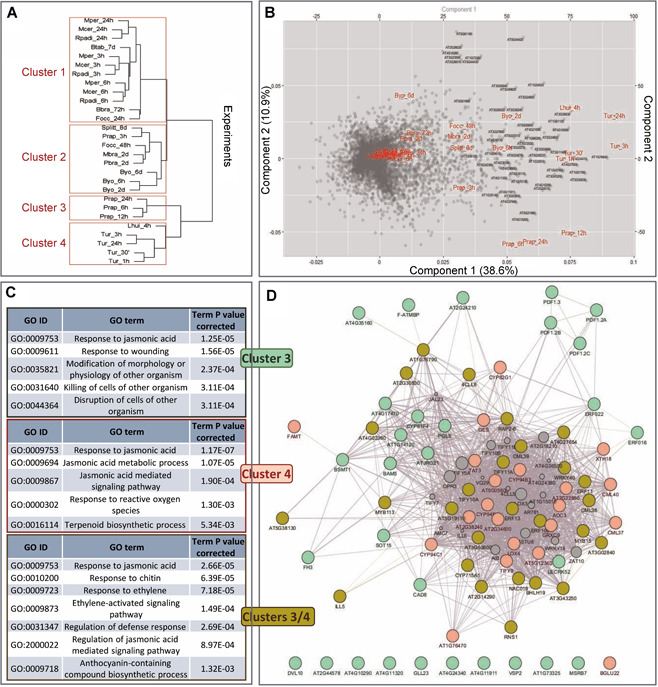
Figure 4.

Clustering of experiments and differentially expressed genes (DEGs)
(A) Hierarchical clustering of experiments based on the expression of the DEGs. (B) Biplot showing the distribution of the DEGs and experiments. Dots represent the genes in the biplot, and red color the experiments. Gene names of the top 100 genes with the highest contribution to the variability of the data are included. (C) Enriched biological processes associated with the genes induced specifically in any cluster. (D) Gene network connecting the DEGs induced specifically in cluster 3 (pale green), cluster 4 (pink), or both clusters (olive green). Size of additional nodes (gray) is based on the GeneMANIA scores.
