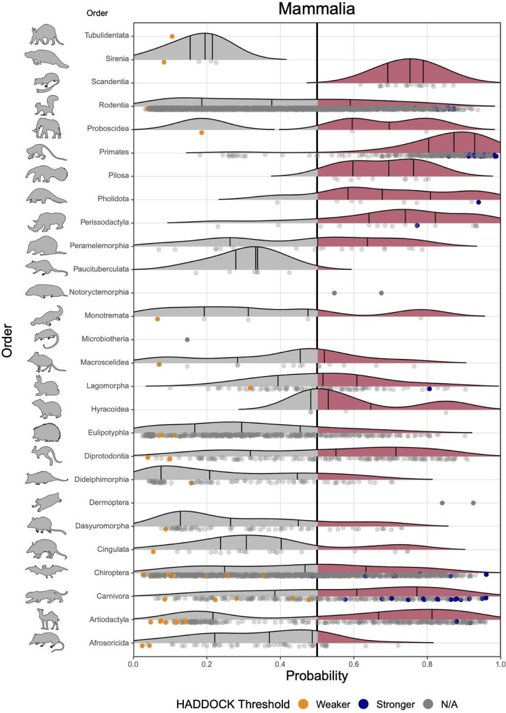
Figure 4.
Ridgeline plots showing the distribution of predicted zoonotic capacity across mammals. Predicted probabilities for zoonotic capacity across the x-axis range from 0 (likely not susceptible) to 1 (zoonotic capacity predicted to be the same or greater than Felis catus), with the vertical line representing 0.5. The y-axis depicts all mammalian orders represented by our predictions. Density curves represent the distribution of the predictions, with those parts of the curve over 0.5 colored pink and lines representing distribution quartiles. The predicted values for each order are shown as points below the density curves. Points that were used to train the model are colored: orange represents species with weaker predicted binding, blue represents species with stronger predicted binding. Selected family-level distributions are shown in the Supplemental Figures 5–6 (https://doi.org/10.25390/caryinstitute.c.5293339).

