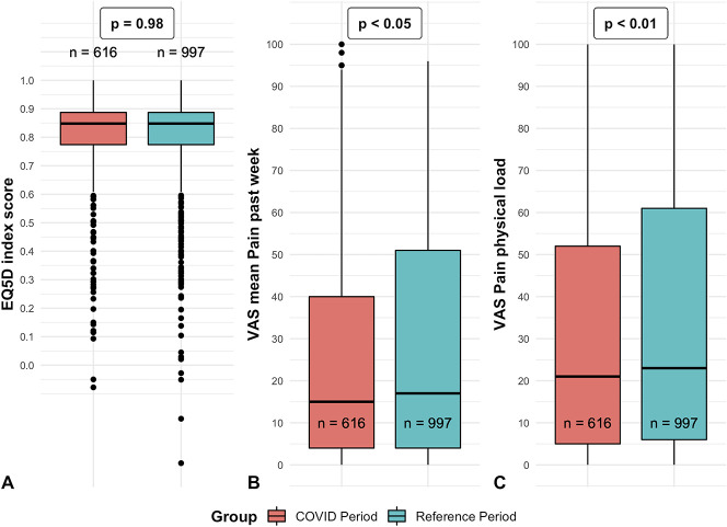
Fig. 3.
A-C These boxplots demonstrate the distribution of the (A) index EQ-5D score, (B) mean VAS score for pain in the past week, and (C) VAS score for pain during physical load. The p values refer to the significance of the adjusted group factor from the linear mixed model analyses. The X represents the mean, whereas the horizontal line represents the median. The dots represent outliers.

