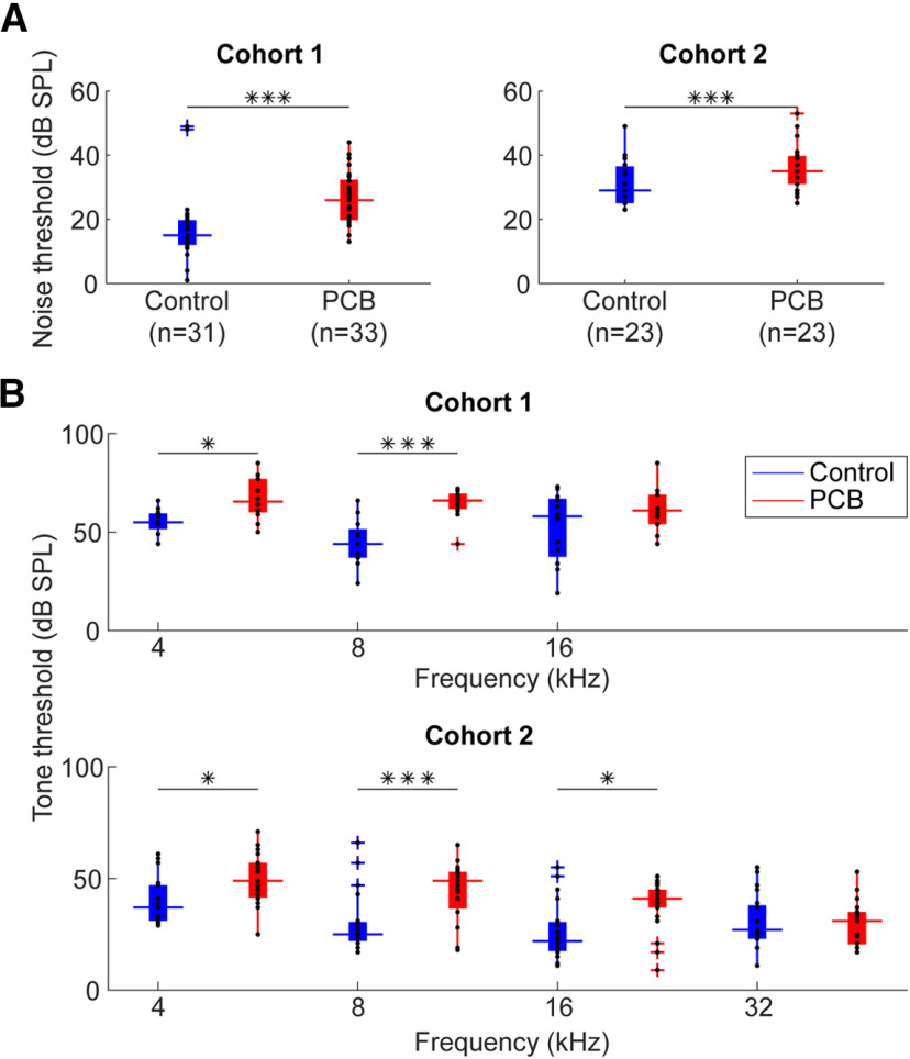
Figure 2.
Comparison of ABR thresholds. A, Comparison of ABR thresholds in response to noise between control (blue) and PCB (red) treatments. Boxplots indicate median (horizontal bar), 25th and 75th percentiles (box), range of non-outlier points (vertical whiskers), and outliers (crosses). Black asterisks indicate significant comparisons; *p < 0.05, ***p < 0.001. B, Comparison of thresholds to 4-, 8-, 16-, and 32-kHz tones.

