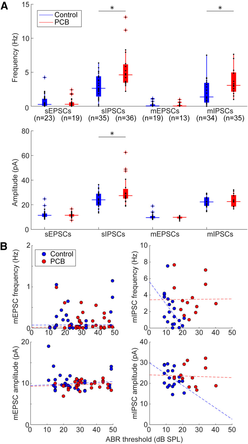
Figure 4.
Comparison of spontaneous and miniature synaptic currents. A, Comparison of frequency of synaptic currents between control (blue) and PCB-treated (red) neurons (sample sizes indicate numbers of neurons). Boxplots indicate median (horizontal bar), 25th and 75th percentiles (box), range of non-outlier points (vertical whiskers), and outliers (crosses). Black asterisks indicate significant comparisons, *p < 0.05. B, Relationship of ABR threshold and sIPSC frequency for control (blue points) and PCB-exposed (red points) groups. Dashed lines indicate robust linear regression fits.

