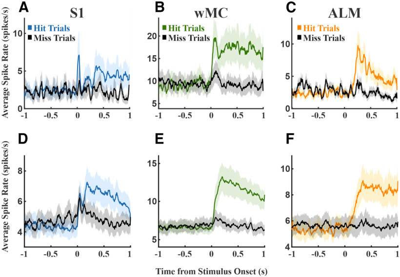
Figure 6.
Comparison of spike rates on hit versus miss trials. Colored plots denote hit trials, black plots denote miss trials. A, An example S1 session showing moderately higher hit-related spiking immediately poststimulus and during the response window. B, An example wMC session, showing robust increased and sustained hit-related spiking that emerges immediately poststimulus. C, An example ALM session, showing robust increased hit-related spiking that emerges late poststimulus. D–F, Average spike rates across all sessions for S1, wMC, and ALM recordings, respectively.

