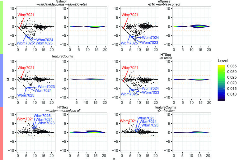
FIG 4.
MA plots comparing wBm fragment counts obtained using FADU against those obtained using other quantification tools. The fragment counts for the stranded wBm data set obtained using FADU were compared to the counts obtained using methods representative of the different clusters of quantification methods. The x axis denotes the mean average from the two compared counts (A), while the y axis denotes the log2 ratio of the two compared counts (M) as a scatterplot (left) and a density plot (right). The horizontal orange dotted lines on each plot are drawn at log2 ratio values of 2 and −2. Points with a log2 ratio greater than 2 and less than −2 were defined as genes counted differently by FADU relative to its counterpart tool.

