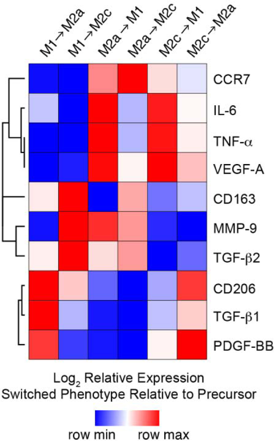
Figure 6.

Hierarchical cluster analysis of surface markers and growth factor production data for macrophage polarized to 3 different phenotypes (M1, M2a, M2c) using established cytokine cocktails for 3 days and then cultured with alternative polarizing (M1→M2a, M1→M2c, M2a→M1, M2a→M2c, M2c→M1, M2c→M2a) stimuli for 3 additional days. Columns represent each culture condition; rows represent each surface marker or growth factor. Heat map colors represent the relative production of each biomarker normalized to the value of the predecessor (e.g. M1→M2a relative to M1, etc.), with blue indicating production that the value is in the lower half of the range across treatments for that biomarker and red indicating relatively elevated levels, as indicated in the scale bar (log2-transformed scale).
