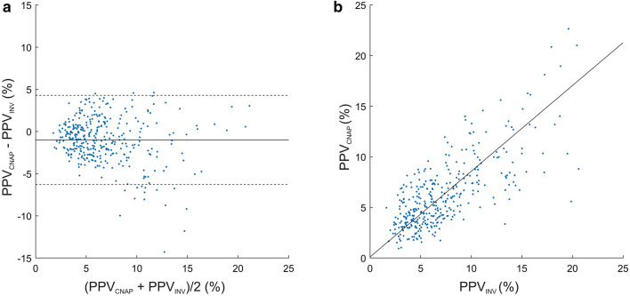
Fig. 4.
Bland–Altman and scatter plot comparing PPVCNAP and PPVINV. a Bland–Altman plot illustrating the mean of the differences (bold horizontal line) and 95% limits of agreement (lower and upper dashed horizontal lines) between PPVCNAP and PPVINV. b Scatter plot with Deming regression (bold line) illustrating the relation of PPVCNAP and PPVINV. PPVCNAP CNAP finger-cuf-derived automatically calculated pulse pressure variation using the PPVCNAP-algorithm, PPVINV arterial catheter-derived manually calculated pulse pressure variation

