
Fig. 9.
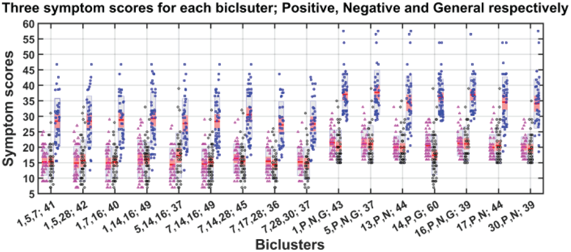
Mean and standard deviation of symptom scores for each bicluster. Each bicluster has three bars representing positive (magenta color dots), negative (black) and general (blue) symptom scores. The dots represent the real data (subject-wise symptom score) and red line in the middle of all bars indicate mean of symptom score. The gray area indicates grouped raw data in mean ± SEM and pink area: mean ± SD.