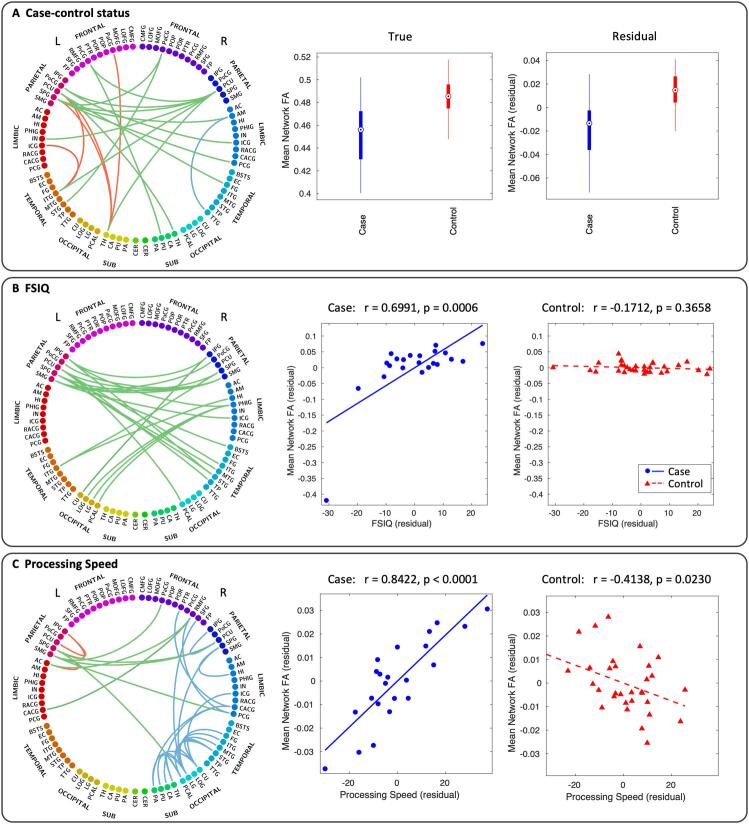
Fig. 6.
Subnetworks given by NBS analysis of case-control comparison (A), correlation with FSIQ (B) and correlation with processing speed (C). Connectograms are shown with interhemispheric connections in green and intrahemispheric connections in red (left) and blue (right). Panel A also shows box plots of the mean FA across all connections in the case-control subnetwork for both the true FA values (left) and residual values after controlling for age and sex (right). In the box plots, the circle is the median, the solid box represents the 25th to 75th percentiles, and the lines extend to the minimum and maximum data points. Panels B and C also show scatter plots of the mean FA across all connections in the FSIQ and processing speed subnetwork, respectively, for both cases (blue circles, blue solid line) and controls (red triangles, red dashed line). The complete list of node label abbreviations is shown in Supplementary Table 7. (For interpretation of the references to colour in this figure legend, the reader is referred to the web version of this article.)

