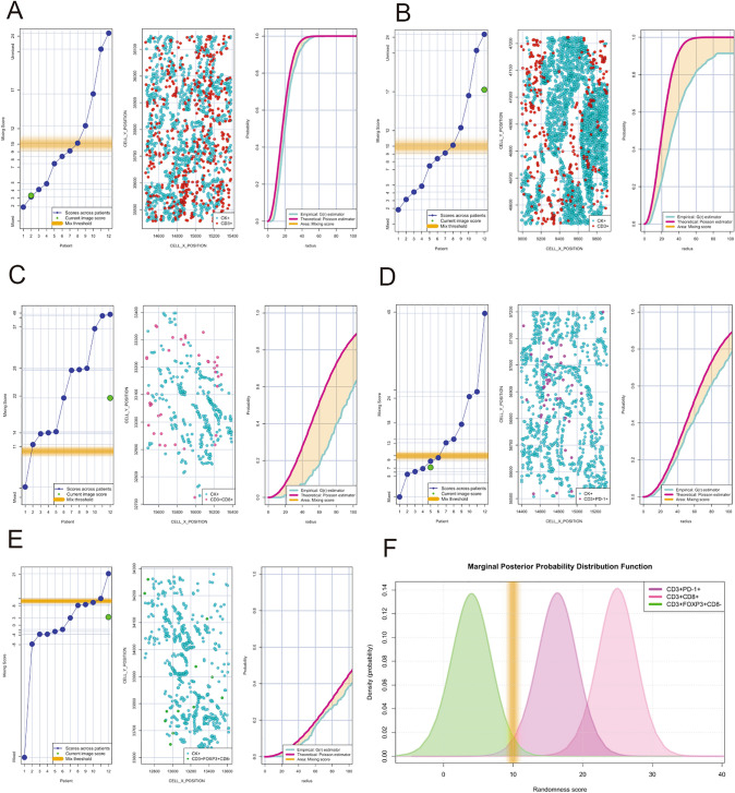
Figure 5.
Individual nearest neighbor distance G function and theoretical Poisson curves graphics for the identification of different cellular patterns of distance distribution from malignant cells (panCK +) to T-cells CD3 + phenotypes. (A to E) showing the scoring scale that the image represent across the cases and the threshold to be considered mixed or unmixed pattern (left side) , graphic distribution representation of the T-cell phenotypes and panCK cells (middle side) and the nearest neighbor distance G function and theoretical Poisson curves area (right side). (A) Mixed pattern distribution between T-cells CD3 + and panCK + cells, (B) unmixed pattern distribution between T-cells CD3 + and panCK + cells, (C) unmixed pattern distribution between cytotoxic T-cells (CD3 + CD8 +) and panCK + cells, (D) mixed pattern distribution between antigen experienced T-cells (CD3 + PD + 1) and panCK + cells, (E) mixed pattern distribution between regulatory T-cells (CD3 + Foxp3 + CD8-) and panCK + cells, and (F) graphical model showing the spatial distribution interaction between cytotoxic T-cells, antigen experienced T-cells and regulatory T-cells related to malignant cells showing the different curves of distribution according the T-cell phenotypes analysed. The images were generated using R studio software version 3.6.1.

