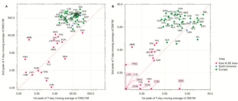
Figure 3.
The peaks of (A) 7-day moving average of daily new cases per million population (DNC/1M); (B) 7-day moving average of daily mortality per million population (DM/1M) of East and South-east Asian countries (red dots), North American countries (blue dots), and European countries (green dots) on the log scale (as of 31 December 2020). Symbols above the diagonal (dashed line) indicate higher numbers in the second wave relative to the first wave, while symbols below the diagonal indicate the opposite. Framed labels indicate countries with zero mortality values on perpendicular axis.

