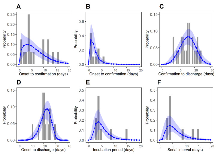
Figure 2.
Best-fitted distributions for epidemiological periods P1–P6. Bars represent the observed data and blue dots represent the estimated values, respectively. Blue shaded regions represent the 95% CI from 1000 samples. (A) Reporting delay of imported cases (P1: symptom onset to confirmation). (B) Reporting delay for local cases (P2: symptom onset to confirmation). (C) Time between the confirmation and the discharge from the hospital (P3: confirmation to discharge). (D) Time between the symptom onset and the discharge from the hospital (P4: symptom onset to discharge). (E) Incubation period (P5). (F) Serial interval (P6).

