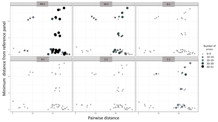
Figure 4.
Scatterplot depicting the relationships between the accuracy of phasing in the number of haplotype estimation errors (size and color of the dots), the pairwise distance between the mixed haplotypes (x-axis), and the minimum distance from the reference panel (y-axis). Each individual panel represents a mixture ratio.

