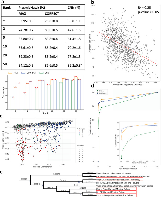
Fig. 2. Prediction results and statistical analysis.
a The performances of plasmid lab-of-origin prediction using PlasmidHawk and the CNN. Data represents mean ± SD of N = 5 independent experiments. b Linear regression analysis between averaged lab Jaccard distances and averaged lab scores. Each dot represents a lab. The x axis shows averaged lab Jaccard distances. The larger the averaged lab Jaccard distance is, the more unique a lab’s plasmids are. The y axis is the averaged lab score. Labs with smaller averaged lab scores are more likely to be returned by PlasmidHawk CORRECT mode as predicted source labs. Two-sided p-value is calculated (p = 3.23e−56). c Principal component analysis of labs based on lab Jaccard distances. The colors label labs based on their sequences’ host cells. The size of the dot corresponds to the percentage of the most abundant host cells inside a lab. Blue: mammalian lab (M), Green: yeast lab (Y), Red: bacterial lab (B), black: N/A lab (NA). d Receiver operating characteristic (ROC) curve for the CNN and PlasmidHawk. e A clade of the lab-relatedness tree. Branch lengths are shown on the top of the branches. Support values are annotated under the branches and marked in blue. Support values equal to 0 are not displayed. Labs who belong to the same academic family tree or have collaborated with each other are highlighted in red.

