
Fig. 2.
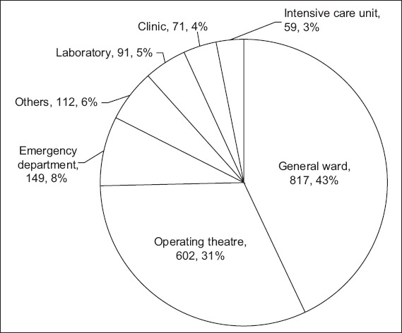
Pie chart shows the distribution of sharps injuries and splash exposures from 2005 to 2014 based on locations (location, number, overall percentage).
Official websites use .gov
A
.gov website belongs to an official
government organization in the United States.
Secure .gov websites use HTTPS
A lock (
) or https:// means you've safely
connected to the .gov website. Share sensitive
information only on official, secure websites.
Pie chart shows the distribution of sharps injuries and splash exposures from 2005 to 2014 based on locations (location, number, overall percentage).