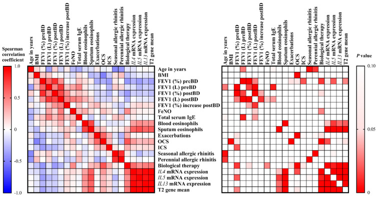
Figure 2.
Correlation heatmap reporting Spearman correlation coefficients and P values for each comparison. The bar on the left side of the map indicates the color legend of the Spearman correlation coefficients, and the bar on the right side of the map indicates the color legend of the P values calculated for each pair of samples in the matrix. The Spearman rank correlation test was used. A p value < 0.05 was accepted as significant. p > 0.10 are presented in white squares.

