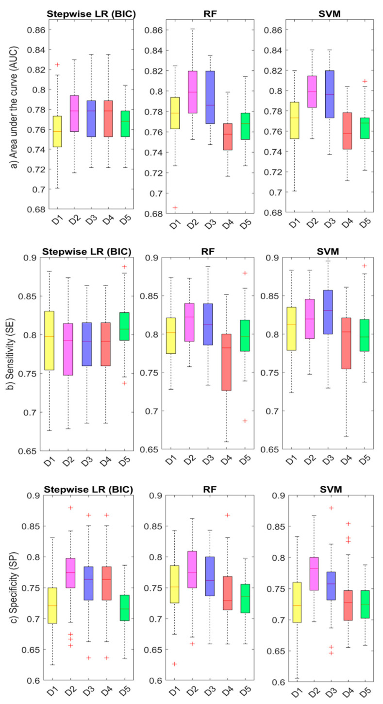
Figure 4.
Comparison of accuracy for different predictor datasets and ML algorithms: the boxplots show the distribution of (a) AUC, (b) SE, and (c) SP parameters for different predictor datasets (D1–D5, see description in Table 4) and ML algorithms (LR, RF, and SVM). The red line represents the mean value (calculated over the 50-fold cross-validation estimates), and the edge boxes the 25th and 75th percentiles. The whiskers represent the minimum and maximum data values not considered outliers, and the outliers are plotted individually using the ‘+’ symbol in red.

