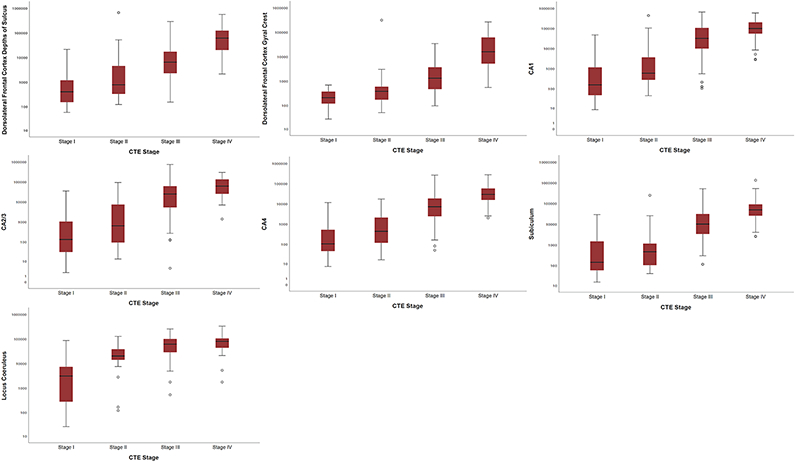
Fig. 1. Box Plots of Quantitative Measurements of Regional P-tau Accumulation by CTE Stage.
Spearman’s rho correlations showed that greater p-tau density was associated with a higher CTE stage for all regions assessed (p’s < 0.001 for all). The sample size was reduced to 176 as this represents the sample with available quantitative data across all 7 brain regions at the time of this data freeze (July 2019). The mid-point line in the box represents the median, the interquartile range box represents the middle 50%, and the whiskers represent the bottom and top 25% of data value. Y-axis values are positive pixels (mm2) and are on a logarithmic scale.

