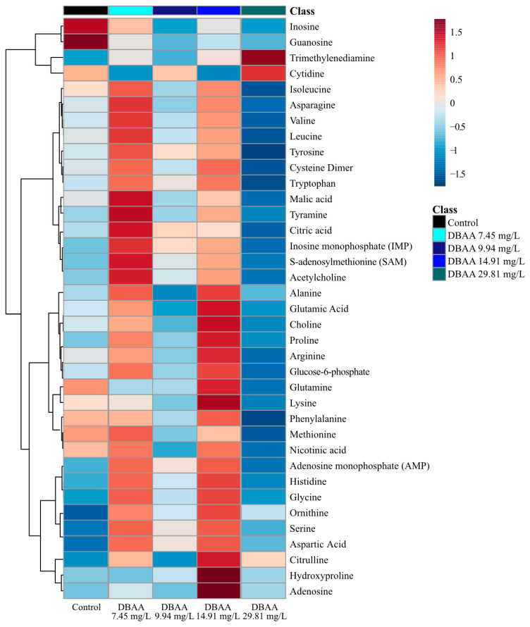
Figure 5.
Analysis of averaged metabolite concentrations (n = 12) where 0 is the average metabolite concentrations across all treatment groups (DBAA exposure and the control). The color gradient (blue to red) shows the relative difference compared to the average metabolite concentration, and metabolites are linked on the left y-axis. The heatmap arranged by dendrogram on the x-axis is found in the Supplementary Materials (Figure S11).

