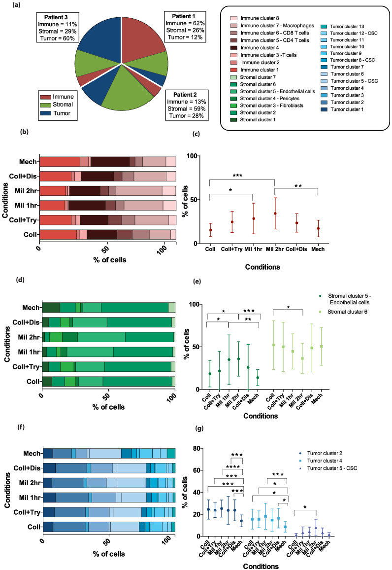
Figure 4.
Differences in specific cell cluster proportions of the total cell population by dissociation method. (a) The pie chart displays the proportions of the three different metaclusters—immune cells in red, stromal cells in green, and tumor cells in blue—in three patients, out of a total of 300%. The graph is based on the pooled results from the six dissociation methods. The patient-specific fractions of each metacluster are shown in the text boxes. (b,d,f) Stacked bar plots illustrate how the identified clusters (color coded according to legend in (a)) within the metaclusters are proportioned in the combined patient samples according to the dissociation method applied for (b) immune cells, (d) stromal cells, and (f) tumor cells. (c,e,g) Error plots displaying the mean percentage of cells in the combined data from three patient samples with standard deviations. The specific clusters included in the figure are those where significant differences between dissociation methods were found by a two-way ANOVA analysis with Tukey’s multiple comparisons test. * p-value less than or equal to 0.05. ** p-value less than or equal to 0.01. *** p-value less than or equal to 0.001. **** p-value less than or equal to 0.0001.

