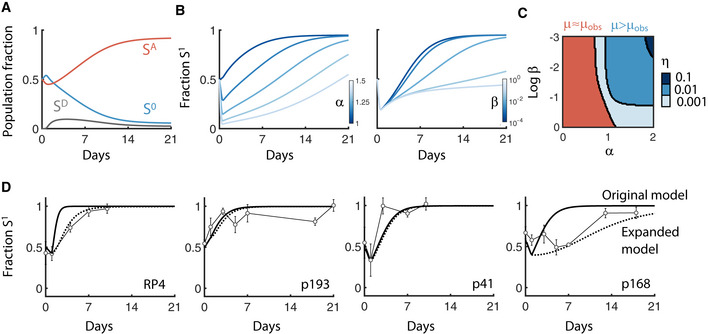
Figure 5. Fitness cost versus acquisition cost.

- Long‐term temporal dynamics of SA, S0, and SD are shown in red, blue, and gray, respectively, from the main model (Fig 4A). X‐axis is time over 21 days, and y‐axis is the fraction of each population.
- A population is initiated with a 1:1 ratio of S0 and SA and the total plasmid‐carrying population fraction (S1 = SA+SD) is tracked over time. Left: β is held constant (β = 0.01) and α is increased from no cost (α = 1) to high cost (α = 1.5). Right: α is held constant (α = 1.2) and β is increased from slow transition (β = 10−4) to rapid transition (β = 1).
- Heat map shows where the observed growth rate of S1 (μobs, calculated using Appendix equation S6) differed from the maximum growth rate under ideal conditions (e.g., μ, if there is no acquisition cost). A 98% threshold was used to numerically define the region where μobs differed significantly from μ (e.g., μobs/μ < 0.98). Any α and β combination meeting this criterion is colored blue and are red otherwise. Changing this threshold did not qualitatively change conclusions (Appendix Fig S9). Changing the conjugation efficiency (η) shifts the boundary (increasing from light to dark shades of blue).
- Validation of modeling predictions using four plasmids from left to right: RP4 (in this study), p193, p41, and p168 (from previous work). Data are reproduced with permission from Nature Communications (Lopatkin et al, 2017), under the Creative Commons Attribution 4.0 International License. Marker shapes and colors were modified for visualization purposes. Solid line shows original model fit (e.g., Appendix equation S1‐S2). Dotted lines show updated model fit (e.g., Appendix equations S3‐S5). Experiments were performed at least twice. Error bars represent the standard deviation of four to six measurements.
