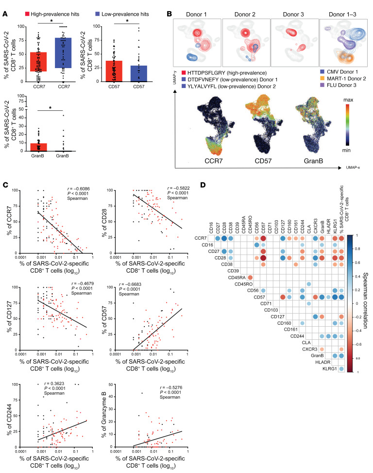
Figure 5. Expansion of highly differentiated SARS-CoV2–specific CD8+ T cells in convalescent donors.
(A) Box plots showing differences in the expression of markers between high- and low-prevalence response hits. High-prevalent response hits showed a higher expression of markers associated with differentiation. Each dot represents 1 donor. *P < 0.05. Kruskal-Wallis test. P values were adjusted for multiple testing using the Benjamini-Hochberg method to control the false discovery rate. (B) UMAP plot showing the relative position of high- and low-prevalence response hits in the high-dimensional space. Data from 3 donors are shown. (C) Scatterplots showing the correlations between SARS-CoV-2–specific T cell frequencies and differentiation marker expression. The magnitude of antigen-specific T cells correlated with the expression of markers associated with T cell differentiation. The correlations were calculated with the Spearman’s rank-order test. Red dots are high prevalence response hits. (D) Correlogram showing the correlation between all phenotypic markers and frequencies of SARS-CoV-2–specific T cells. Later stage differentiation markers positively correlated with higher frequency SARS-CoV-2–specific T cells. Spearman’s correlation coefficients were indicated by a heat scale whereby blue color shows positive linear correlation, and red color shows negative linear correlation. Only significant correlations are shown (*P < 0.05, P values were adjusted for multiple testing using the Bonferroni method).

