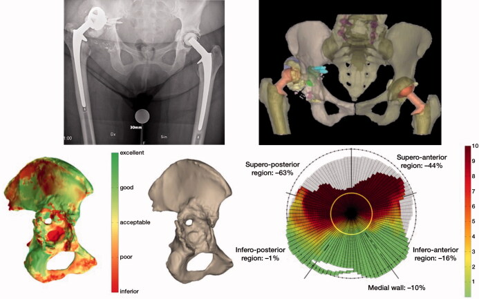
Figure 1.
Bone quality assessed by the software; red color reveals a poor and green shows excellent bone quality. (a): Assessment of bone quality as described by Gelaude. (b): Defect analysis quantifies in percentages and colors bone loss in the different regions of the acetabulum on which the Paprosky classification is based. Red color reveals an inferior and green shows excellent bone quality while yellow is acceptable. The output data consists of a ratio and a graph, which allow the direct comparison between specimens. The amount of original acetabular bone that is missing is defined as a ratio. The remaining bone stock in the radial direction is presented by the graph (c).

