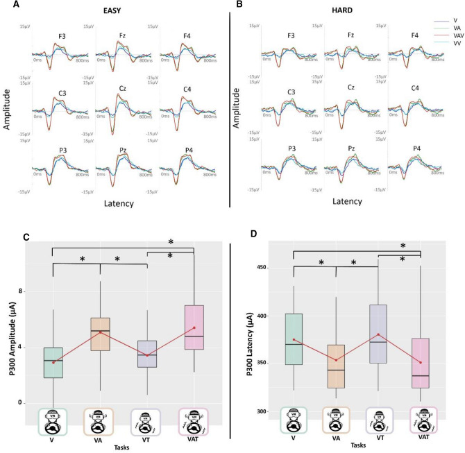
Figure 3.
The figures above (A, B) show respectively the grand average over all the subjects, for each sensory modality and difficulty level, for few representative channels. The figure below shows the significance of the main effect sensory task for the P300 amplitude (C) and latency (D), low and high conditions have been collapsed over both. The black asterisks indicate significant post-hoc tests while red dots and lines refer to the mean. The central line represents the median, the top and the bottom of the box are the first and third quartiles, and the whiskers are the interquartile range of the lower quartile and of the upper quartile multiplied by 1.5.

