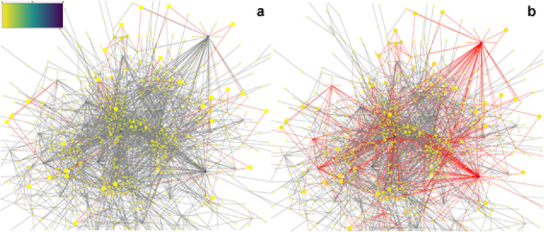
Figure 2.
DGE-PPI network. (a) It represents a gathering and merging of the DGE analysis results and the Human Protein–Protein Interaction network from the Mentha Database. Red lines represent the connections of the gatekeepers. Color scale is presented in the left top corner. It represents the color scale applied to show graphically the values in the centrality measure for each node in the networks. (b) The red lines represent the connections of the gatekeepers plus the connections of its first neighbors (direct connected nodes to gatekeepers). The red lines comprise most of the network connections. (a,b) The proteins with less connections are marked in yellow and the most connected proteins are marked in navy blue purple. The size of each node represents the value of the clustering centrality measure; The bigger, the more value it has.

