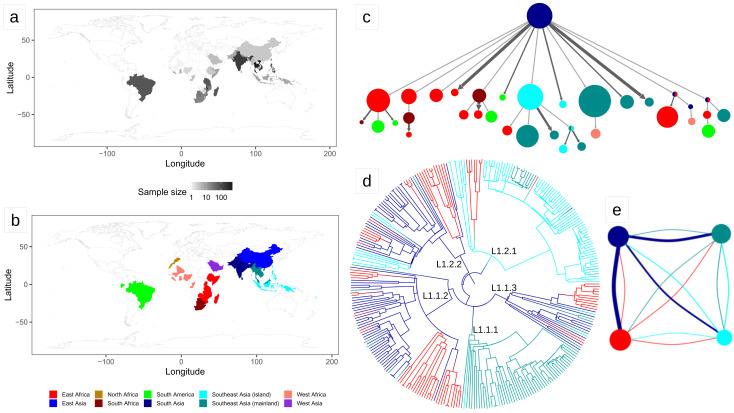
Figure 1. Results of the biogeography analysis: L1.
a) Heatmap indicating the origin of the 2,061 L1 strains included in the dataset used for the biogeography analysis. b) The geographic regions used in the biogeography analysis of L1. c) Results of PASTML (compressed tree), the color code follow the legend of panel ( b), the size of the circles is proportional to the number of tips, and the size of the arrows is proportional to the number of times the pattern of migration was observed on the tree. This plot excluded nodes that represented less than three strains. The same plot including all nodes can be found as Extended Data File 1. d) Tree obtained with the Mascot analysis; the branches are colored following the legend in panel ( b) and represent the inferred ancestral region with the largest posterior probability. e) Representation of the relative effective population sizes (circles) and migration rates (lines connecting circles) estimated by Mascot. Lines representing migration rates are colored based on the region of origin (interpreted forward in time). For example, the dark blue line connecting the dark blue circle with the red circle represents the forward migration rate between South Asia and East Africa, which is the largest migration rate estimated by Mascot. The parameter estimates are reported in Extended Data Table 2.

