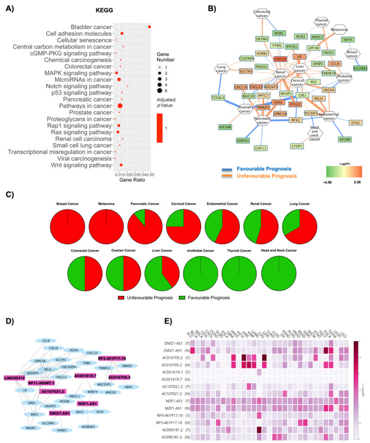
Figure 5.
Cancer pathways and oncogene analysis in OBT2D vs. OBF. (A) Dotplot of deregulated oncogenic pathways from KEGG analysis. The y-axis represents the name of the pathway, the x-axis represents the gene ratio, dot size represents the number of different genes and the color indicates the adjusted p-value. (B) Nodes are DE RNAs and are ranked according to fold change whereas edges indicate disease prognosis and are colored according to favorable (light blue) and unfavorable (orange) prognosis. (C) Pie graph displays the overall unfavorable or favorable prognosis. (D) Co-interaction network between lncRNAs on OBT2D vs. OBF and the oncogenes highlighted after OncoScore analysis. Four networks were built, including a total of 8 lncRNAs. (E) The GEPIA2 database displays the specific annotated expression of each lncRNA in tumoral and normal tissues.

