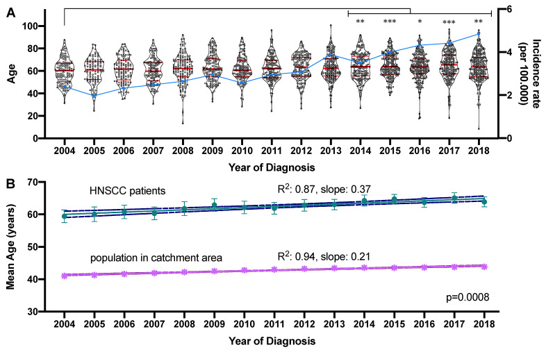
Figure 2.
Development of the age at diagnosis and newly diagnosed cases between 2004 and 2018. (A) The mean age of the 2450 patients diagnosed between 2004 and 2018 is graphed on the left y-axis as a violin plot showing all individual values. The median and quartiles are indicated by red horizontal bars. Significant changes in the mean age compared to 2004 are indicated by asterisks. The incidence rate of newly diagnosed cases per 100,000 is graphed on the right y-axis in the form of a blue line. * adjusted p-value < 0.05, ** adjusted p-value < 0.01, *** adjusted p-value < 0.001. (B) Linear regression model of the mean age in the HNC patient cohort and the population in the main catchment area. The mean age ± standard deviation is indicated by the symbols and the linear regression model is shown as the connecting line with the upper and lower 95% confidence interval indicated by broken lines.

