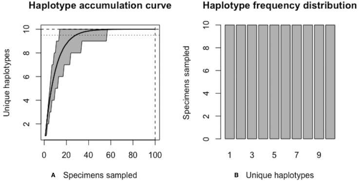
Figure 5. Graphical output of HAC.sim() for a hypothetical species with equal haplotype frequencies.
(A) Iterated haplotype accumulation curve. (B) Corresponding haplotype frequency barplot. For the generated haplotype accumulation curve, the 95% confidence interval for the number of unique haplotypes accumulated is depicted by gray error bars. Dashed lines depict the observed number of haplotypes (i.e., RH*) and corresponding number of individuals sampled found at each iteration of the algorithm. The dotted line depicts the expected number of haplotypes for a given haplotype recovery level (here, p = 95%) (i.e., pH*). In this example, R = 100% of the H* = 10 estimated haplotypes have been recovered for this species based on a sample size of only N = 100 specimens.

