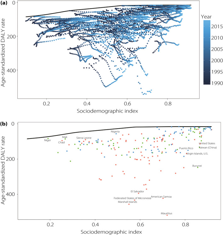
Figure 5.

(a) Frontier analysis based on Sociodemographic Index (SDI) and age‐standardized disability‐adjusted life year (DALY) rate from 1990 to 2017. Color scale represents the years from 1990 shown in dark blue to 2017 shown in light blue. The frontier is shown in black color. (b) Frontier analysis based on SDI and age‐standardized chronic kidney disease as a result of type 2 diabetes mellitus DALY rate in 2017. The frontier is shown in black color; countries and territories are represented as dots. The top five countries with the largest effective difference, examples of countries with low effective difference and low SDI (<0.5), and examples of countries (territories) with relatively high effective difference and high SDI (>0.8) are labeled in black. Blue dots indicate countries in the moderate group with compatible declining DALY rate as SDI increased. Green dots indicate countries in the overperforming group. Red dots indicate countries in the underperforming group.
