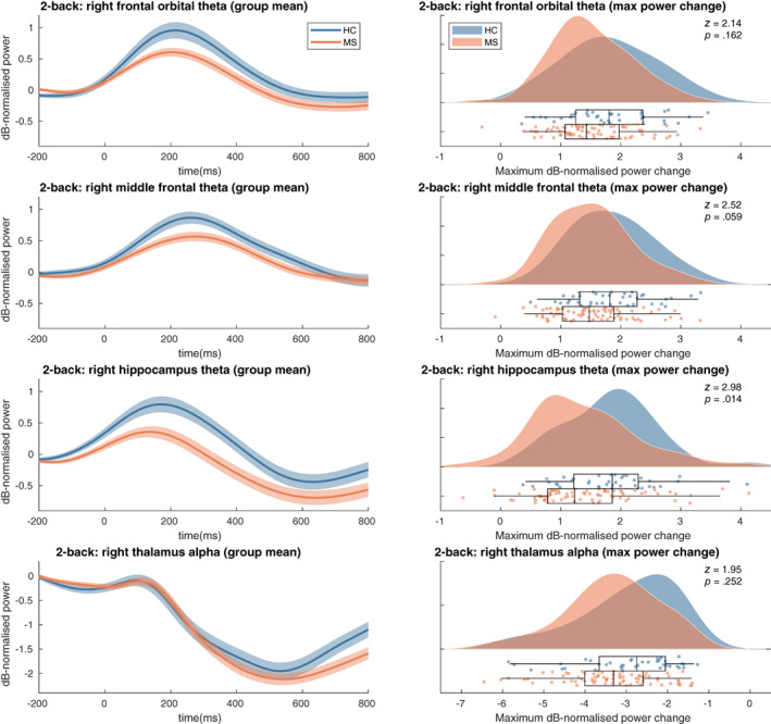
FIGURE 5.

Time‐frequency max power changes results. Left panels: shaded error bars (using standard error) of group mean power changes in the selected ROIs. Right: raincloud plot of distribution of maximum power change values per group in selected ROIs. See Figure A1 for t‐statistics of the single group and group difference tests on the power change timeseries for all parcels. HC, healthy controls; MS, multiple sclerosis patients
