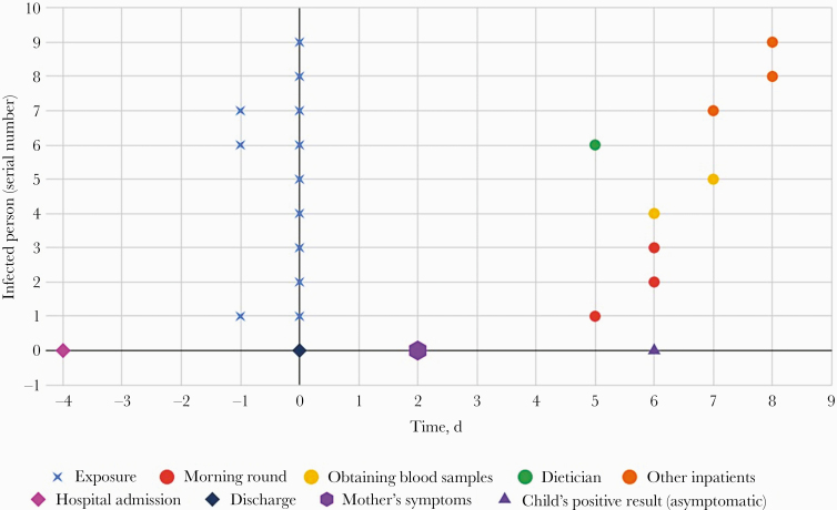
Figure 2.
A time graph of admission time, indexes exposures, and positive results. Each line represents an index case. The blue X represents the exposure time. The circle represents the time of coronavirus disease 2019 diagnosis (for symptomatic patients, the positive result was received on the same day the symptoms began).

