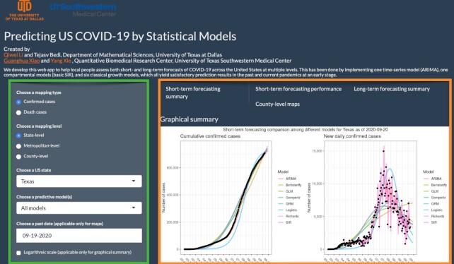
Figure 5:
The web interface of the COVID-19 trend analysis page. The green box highlights the input panel that allows users to choose different mapping types and levels for a region. The orange box highlights the visualizations for short-term forecasting as per the instructions of users. Other tabs offer different graphs for summarizing the model performance, long-term forecasting, and county-level spatial maps.

