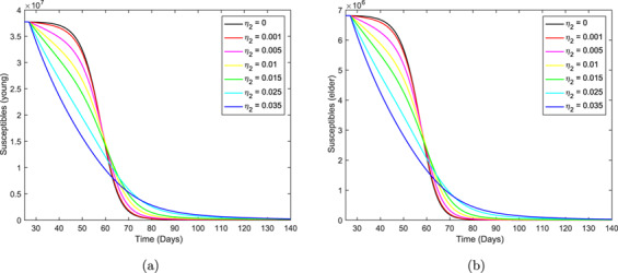
Fig. 14.

The curves of the number of susceptible persons  ,
,  , without and with isolation for different values of
  . Curves from top to bottom correspond to the increasing
  . The beginning of the isolation occurs at
  days.
days.

The curves of the number of susceptible persons  ,
,  , without and with isolation for different values of
  . Curves from top to bottom correspond to the increasing
  . The beginning of the isolation occurs at
  days.
days.