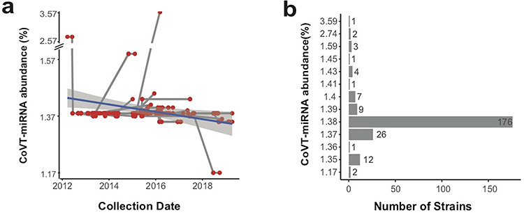
Figure 3.

CoVT-miRNA abundance of MERS-Cov. (a) Transmission network of MERS-CoV haplotypes plotted according to their CoVT-miRNA abundance and sampling data throughout the course of the MERS epidemic. Each red dot indicates a haplotype, and the gray lines connecting haplotypes represent relationship of transmission. The navy line depicts the linear regression of the CoVT-miRNA abundance. (b) The number of MERS-CoV strains at different CoVT-miRNA abundance levels.
