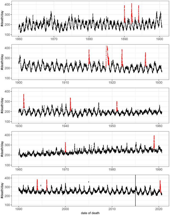
Figure 1.
Number of deaths per day as a function of time. For visualization the original count data have been smoothed by rectangular window of length seven. That is, each value represent the mean value of the neighboring seven values. Detected outbreaks are shown in red. Note that the peak of the outbreak of 1918–1919 has been truncated. The vertical line indicates the time point at which there was a change in data source (see Methods).

