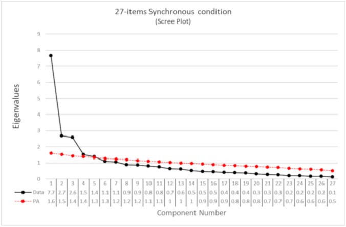
Figure 1.

Scree-plot of the PCA on the 27 items after synchronous condition. The eigenvalues are reported in the table below the graph. The black dots represent the eigenvalues of each component in decreasing order calculated on the real data. The red line shows the simulated data of the parallel analysis. Components above the red line are those indicated by the parallel analysis. The gap after the third component in the scree-plot suggests considering a three-components solution.
